Edmonton Oilers Jersey History: A Visual Journey
From the golden dynasty of the 80s to Adidas innovations, the history of the Edmonton Oilers uniforms reflects the team's ups and downs.

#hockey#nhl#edmonton oilers#jerseys#sports
The Edmonton Oilers, a National Hockey League (NHL) team, have been known for their 'all or nothing' nature. For their first 13 seasons, starting in 1979-80, the Oilers made the playoffs every single year, winning five Stanley Cups and only losing in the first round on three occasions. Star players shone throughout the team, including goalies Grant Fuhr and Andy Moog, defenseman Paul Coffey, and forwards Glenn Anderson, Jari Kurri, Mark Messier, and Wayne Gretzky himself.
In the next 23 seasons, the Oilers made the playoffs seven times, winning only five playoff rounds, three of which came in their improbable run to Game 7 of the Stanley Cup Final in the chaotic post-lockout 2005-06 campaign. After that magical Cup run, Edmonton missed the postseason for ten consecutive years. Thankfully, they were able to end that tough stretch the following year, as they put up 103 points during the 2016-17 regular season, which was good enough for second place in the Pacific Division. Though they lost in the second round to the Anaheim Ducks, it appeared they were well on their way to becoming a dynasty once again.
In the next 23 seasons, the Oilers made the playoffs seven times, winning only five playoff rounds, three of which came in their improbable run to Game 7 of the Stanley Cup Final in the chaotic post-lockout 2005-06 campaign. After that magical Cup run, Edmonton missed the postseason for ten consecutive years. Thankfully, they were able to end that tough stretch the following year, as they put up 103 points during the 2016-17 regular season, which was good enough for second place in the Pacific Division. Though they lost in the second round to the Anaheim Ducks, it appeared they were well on their way to becoming a dynasty once again.
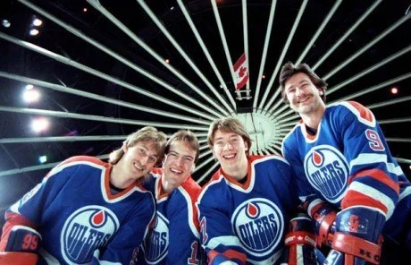
The history of the Oilers' uniforms has been as variable as their fortunes on the field. The kits of the golden era, used during their dynasty years, remained relatively unchanged until the end of the 1995-96 season. These uniforms, with their soft blue and orange as an accent, represented the perfect balance between professionalism and visual appeal. The three-stripe pattern on the sleeves and tail, along with the accented cuffs on the away uniforms, were distinctive. The two-tone collar design, where the inner color of the yoke flowed into the inside of the collar, was particularly noteworthy.
My only complaint would be the numbering, as I generally don’t like offset trim on the numbers. To me, the flush alignment of number and trim looks cleaner and more polished, but these are small potatoes in an otherwise excellent dish.
My only complaint would be the numbering, as I generally don’t like offset trim on the numbers. To me, the flush alignment of number and trim looks cleaner and more polished, but these are small potatoes in an otherwise excellent dish.
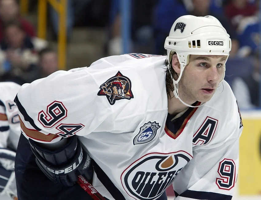
In 1996-97, the team adopted a midnight blue and copper color scheme, adding a secondary logo of an oil worker known as 'Rigger'. The following season, the shoulder yokes were removed from the home jerseys, completing the home and away kit for the next decade. Although in an era of bright colors, the Oilers chose a dark palette, which, paradoxically, could be considered ahead of its time, given the NHL's later emphasis on darker uniforms. The combination of copper and blue, although unusual, worked well, although the inclusion of red stripes in the copper design remains a mystery.

The Reebok Edge uniform system marked the end of the 'Oil Drop' era, with the introduction of new designs for the home and away uniforms. However, the changes were minimal and criticized for their lack of originality. The absence of stripes on the tail and the substitution with vertical piping, along with the lack of complete stripes on the sleeves, resulted in a design that resembled a generic uniform. The numbering with offset borders and the red borders persisted, contributing to the perception of a careless design. The 'Oil Drop' jersey, designed by Todd McFarlane, was especially criticized for its uninspired color scheme and metallic logo, which represented the Oilers' five Stanley Cups. The uniform, with its asymmetrical design and laced collar, failed to connect with fans.
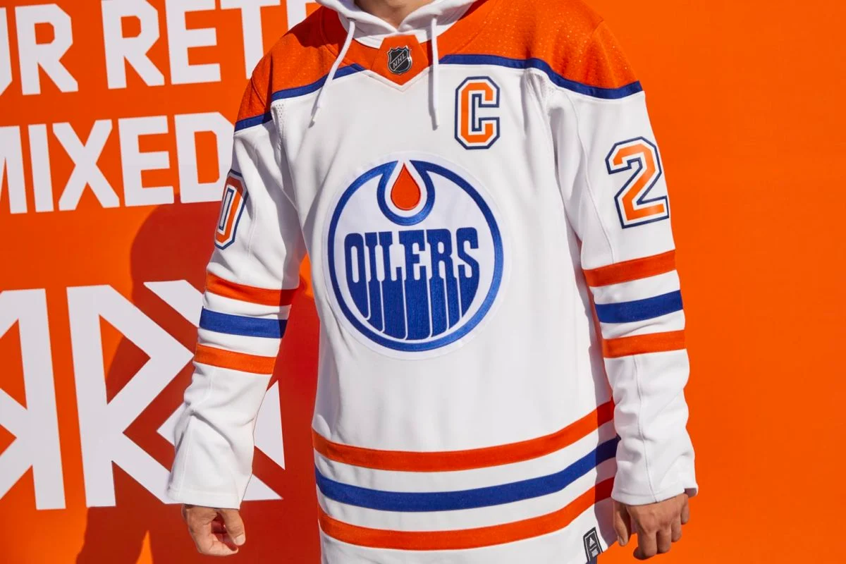
For the 2008-09 season, an updated version of the Oilers' dynasty kit was reintroduced. In 2012-13, Edmonton adopted this vintage look full-time. In 2015-16, an alternate kit was added that paid homage to the World Hockey Association era. The home and away kits mirrored the original NHL designs, with the main difference in the collar. However, the alternate kit, based on orange, generated controversy due to the excessive use of this color, which led to the design appearing washed out. The arrival of Adidas brought some changes, including a lighter orange and a darker blue, which were well received by fans.
The history of the Oilers' uniforms reflects the team's ups and downs, with their best designs associated with their years of success. Although they have gone through difficult times, both their uniforms and the talent on the ice seem to be on an upward trajectory.
Related Stories
OMNI•2 min•

OMNI•4 min•